Here is the screencast for my final reflection
And here is a link to my MMP Project
Creating a PD toolkit is a great idea. It helps to have a variety of resources available to choose from and to share with colleagues. Sometimes, though, I feel like I’m drowning in too many resources. It’s like the book The Paradox of Choice by Barry Schwartz. Schwartz argues that providing too many choices can cause anxiety and lead to unhappiness. We need autonomy to make decisions, but many times our ability to make informed decisions, at least from a consumer standpoint, is not typically based on empirical evidence, but rather anecdotal evidence (word of mouth) or packaging. Sometimes I feel like educational resources are the same way. So I didn’t spend a lot of time reviewing exactly what I put in, but I tried to include topics related to educational equity, assessment, and universal design for learning.
I am glad that this site pares down the topics and organizes the information into distinct categories for educators. Having some resources was helpful. Unfortunately, many of the resources I was searching for were not live. I was directed to many resources that were no longer in existence. Also, I felt like the variety of resources included here and on the website ranged from government publications to personal websites making it challenging to evaluate the quality of the sites.
Nevertheless, I personally feel that PD is a responsibility of schools and school leaders. The make up of class populations and student generations differs and continues to diversify and grow. Chances are that today’s corps of teachers are going to be culturally different from the students they teach, and they will possibly come from different social-economic backgrounds than their students as well. Teachers may not be as prepared to address these issues of incongruity in the classroom, and as a result, need better preparation and ongoing development in best practices and differentiating their instruction to meet their students’ needs. I also feel like it is important to add some urgency to address these issues of inequity in schools, especially in urban schools, where PD may be centered around test preparation or other tasks associated more with administrative duties.
Thus, I included a resource for addressing the digital divide, an article on improving differentiation strategies, leveling the playing field for K-12 Online Education, a resource for improving reading through technology, and a tool to enable leaders and teachers to examine and assess where they are on a technology implementation scale.
When I was creating this toolkit, I was thinking about my own experiences with PD and teaching, and the current group of teachers I work with. Many of them are excellent teachers, but there are definitely some teachers that I observe that struggle with adapting to the changing demographics of students. I also see other teachers struggle to teach and differentiate their practices to adjust to individual student needs. This ends up, in some cases, causing confrontations and other management issues in the classroom, at least from what I have observed. In working with some of these teachers, they are very receptive to new ideas and practices, especially when they are specific and given some kind of practical application of the strategy or approach. What I think trips up some teachers is when we talk in generalities or throw terms around like “differentiation” without giving any specific or concrete examples of how the teachers can accomplish these actions. I think that finding more specific and concrete examples and resources will help teachers grow and develop.
For this assignment, I only watched the first two videos. The first video, “Copyright on Campus”, was useful and the animated characters all asked great questions or raised important points and highlighted the misconceptions about copyright that many people may have. I’m not sure if it was the intention of the director to have the librarian spout off the legalese so that it was difficult to actually understand what the laws for copyright use are in the classroom. If so, it did help me realize how vague and ambiguous some of these laws are. Nevertheless, it was helpful when she provided some examples to clarify these laws. Last year, I was working on a project to provide resources for faculty members to teach students to avoid plagiarism. There are many different tutorials available for students to use (Rutgers has one of the more interesting ones). However, in our design, we had to use creative services at Temple University and our subscriptions to some of the photo services to select images that were not copyright infringements. It was interesting because this was something I had never really thought about before or participated in. Even the use of the Temple logo was regulated, and we had to use a specific logo and color scheme to align with the university’s standards.
Although this video helped provide some examples, I actually appreciated the second video “Understanding ‘Fair Use’ in a digital world”. What I really appreciated with this video was that the students were getting a hands on lesson in understanding the law. They were actually provided with an opportunity to think like a lawyer or judge, gather evidence, and evaluate the use of copyrighted material based on the law. I thought that the activity was incredibly useful in many different ways, and gave the students an opportunity to not only apply the terms of the law to real examples, but also reflect on their own use of copyrighted material. It was great that the students were so reflective about using digital technology in their lives, and how this assignment made them reconsider their use of material online. I felt like this activity was a better example for working to explain copyright laws to not only younger students, but possibly older students and adults as well. Although the first video had some examples, it was more like direct instruction: “I am going to read the rule, and then give examples. You will have opportunities to raise questions or give your own examples to clarify your thinking.” In the second video, the teacher allowed the students to examine examples, find evidence of copyright infringement, and explain why this was or was not infringement. As she mentioned, there is a certain power in the use of discussion within the groups. The students can work to understand the concepts much better since they are co-constructing their interpretation of the law and using their own found examples.
I guess it might just be my preference for constructivism, but I appreciated this second video more than the first because it provided opportunities for students to collaborate, discuss, and create their own understanding of the law, rather than have someone define the law, provide examples, and then clarify any of the students’ (or in this case the professors’) misconceptions. I also think the active engagement is bound to appeal to a variety of audiences, whereas watching a video with a great amount of legal jargon, might be challenging for others to understand.
For the text-based assignment, I went to the “Teaching Copyright” site. I appreciated this site because it not only provided an excellent rationale for teaching students copyright laws, but there were many lessons on this topic, and there were many different handouts and other resources that teachers and students could use to learn about this confusing and, in their words, misinformed, idea.
As for my own perspective, before working on that project, I generally assumed that it was acceptable to post materials from other resources for educational purposes. When I was teaching in a high school, I taught a film class. Although I had a subscription to Netflix, we often used clips of scenes found on Youtube to highlight certain editing and camera techniques. In addition, students frequently used stills from the movies in their presentations to highlight specific techniques directors used. I would also copy journal articles and book chapters to supplement many of the texts we read in class. I did this more for the AP English class that I taught. I generally knew it was inappropriate to copy these texts, but I just somehow convinced myself that I bought the text, and that my students were not going to sell these photocopied items. I also felt like they had no reason to purchase these sometime expensive texts for only 1-2 articles or chapters. When I taught a university level class, the course coordinator made sure that the reading assignments were from the library reserve. We bought a subscription to certain films to show students as well, and shared them with the class (which was permissible according to the one website for Groundspark. We also frequently used Frontline videos since these are free as well. However, I did end up contributing some reading and viewing assignments which were, according to the Copyright on Campus video, not properly attributed or distributed. We used Blackboard as a course management system, and basically I uploaded these documents or provided links to some of the clips we used.
My perspective on copyright law changed with my work at the Teaching and Learning Center when I was tasked with creating a plagiarism tutorial for professors. We actually never ended up publishing the tutorial, but we worked hard on drafting a script (finding and citing our own research), and then selecting common use or creative services photos that were deemed appropriate by the University’s communication center. I never realized how much branding and selection goes in to identifying fair use clips and pics (and sometimes music) for use at the university. I naively believed that anything for educational purposes primarily granted use on it. It was helpful to learn about and revisit many of the confusing and complex laws of copyright. I also think that it is integral that students learn these rules as well.
Here is a link to my Multimodality video. I used iMovie, but I did not find the process easy, at least with creating titles and typing in text. Maybe there is something wrong with my phone screen. Regardless, I wanted to take a look at the different ways we use technology. I borrowed two images from Tumblr, but I couldn’t find the original attribution. The rest of the video was shot on “location”. I also used some audio recordings that I made many years ago, and removed the original audio tracks from the video.
Rather than attempting to draw a storyboard and then scan it, I used an online application that I think will be helpful for me in planning. It’s called Storyboard That. I have horrible hand to visual skills– not just in my drawing (which is really bad), but also in my handwriting. I’d prefer to type and use other tools rather than hand draw things, so I found this tool somewhat useful. I was able to sign up for a free teacher trial that expires in 14 days. This allowed me to upload some screenshots of the programs and resources I plan to use.
As for the tenets of design, I plan to use some light secondary colors, like greens and purples. I appreciated the idea there are also ways to blend or combine complementary colors, so this will be helpful for me. In addition, I plan to use a sans serif font that is legible, with occasional bold points or underlined sections for emphasis. I plan to use black font as well rather than using some other kind of color that might clash with the background colors. I think that wikispaces keeps navigation for the page on the left side, so I will most likely keep that as well for continuity and familiarity. I will also try not to add too many features or links on one page so that there is a simplicity of design.
I haven’t selected any images yet, nor have really decided what to do for the screencasts, but more than likely, these will go in the middle of the wiki screen, preferably making them somewhat larger and embedding them so that there is easy access to the video and/or podcast.
One other area that I haven’t worked on yet is creating the google form to gather some background data about prospective users of this wikispace. Again, I would like to keep the design simple and limit the amount of questions and input so that users do not get too frustrated or overwhelmed by the type of question, the length of the questions, or the amount of the questions they are being asked.
Story Board for MMP by_ Brian Shevory only at StoryboardThat
Here is a link to the hard copy of my MMP Proposal
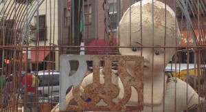
This was a photo from a flea market. I was walking around, and came across this old, creepy baby in a bird cage. It seemed like a strange juxtaposition, so I pulled out my camera and snapped this shot. In taking the picture, I wanted to capture some of the background as well. This allowed me to see what was happening in the setting, and that this was some kind of festival/public event. With the cropping, I tried to remove any instance of outside the cage. The tighter shot focuses more on the cage, and I think portrays more of the confines. It seems to suggest being trapped or stuck. This is also further emphasized by the doll’s expression (or lack thereof) that is better highlighted in the cropped example. 
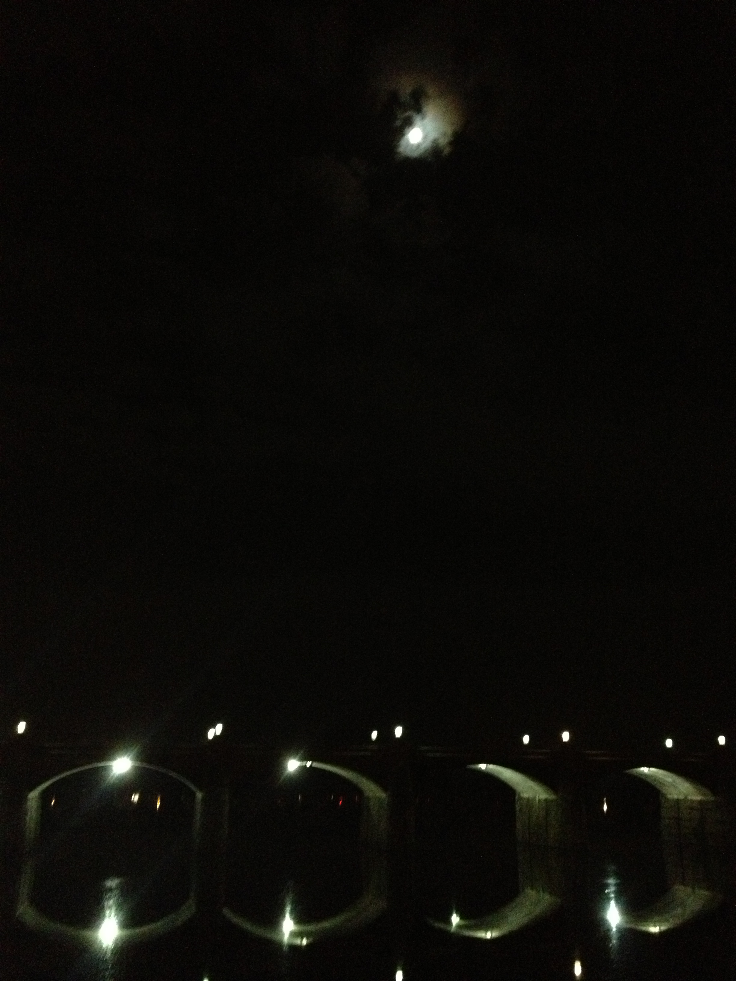
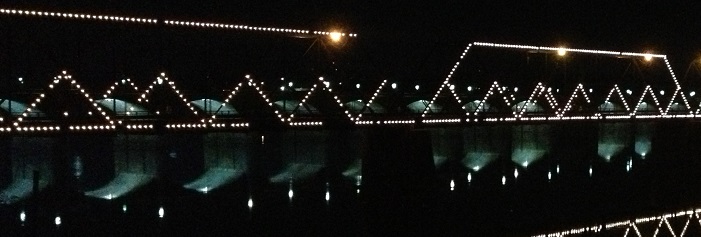
This is a picture of the Susquehanna River at Night in Harrisburg. I think I was out for a run while at a conference, and saw this nice sight. The moon was full, and the bridges spanning the Susquehanna were alight. I tried to capture the reflection since it created kind of a repeating patter both vertically and horizontally. With the cropped version, I just tried to keep the moon in the image and at the same time show at least one of the reflected bridge columns. This came out, but without the repetition, it loses some of the impact of the photo. I don’t think it conveys quite the same meaning.

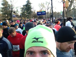
Here’s a shot of me in Central Park waiting to run the NYC Half Marathon. It was a very cold March morning, so runners are trying to stay warm and limber before the race. I believe that there were close to 20,000 runners for this race, so it was incredibly crowded. I wanted to show that there were a lot of people behind me waiting and trying to stay warm. When I cropped the photo, I kept my eyes, and the guy next to me. I think this shows more intensity, and possibly that there might be something wrong. Maybe it looks like I am afraid of the guy behind me, or that I might be paranoid about something.

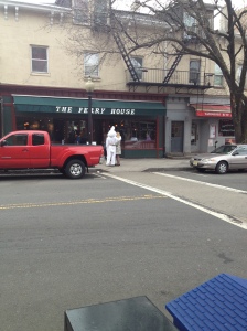
I took this photo in Princeton on Easter. The streets were pretty empty, but for whatever reason, there was an Easter Bunny walking around. I’m not sure if the bunny knew this woman or not, but they paused for a hug in front of the Ferry House. From far away and without any cropping, the image looks almost like nothing. It’s hard to notice the Bunny and the woman, and the other items in the photo (cars, fire escape, tree) kind of distract attention from this. However, when the image is cropped, you can see the intimacy of the moment in that the woman and the bunny have their arms draped around each other. They may be pausing for a photo, or they may be long lost friends, reunited on this special day. It looks like the Ferry House holds some special meaning for them as well in the cropped version.

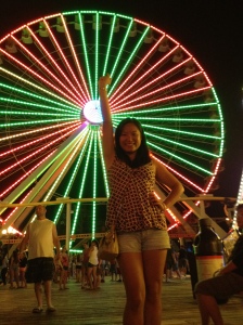
I took this picture of my wife in Wildwood, NJ a few summers ago. I really liked the colors of the Ferris Wheel. It was difficult in the moment to get the entire wheel, and as you can see, part of it was cut off in the shot. Regardless, the colors turned out nice. For the first crop, I tried to crop out any people (although one random guy remains). I also tried to cut the wheel in half to give a kind of Gestalt feel, but because of the bar in the front and the missing left half, it didn’t completely turn out. I then tried to just crop the wheel and emphasize my wife. This turned out pretty nice. The background is not completely clear, but the lights add a nice effect.


This is a picture of El Morro, one of the two castle/fortresses in Old San Juan, Puerto Rico. This was a shot of one of the watch towers that overlooked the Caribbean Sea. There was a walled walkway to the outlook. I got down on a knew and shot this picture of my wife. I liked the way the walls show continuous movement towards my wife and the tower. I cropped two images: One without my wife, and only with the top of the tower. This gives a strange, incomplete look. The other image is of my wife, but headless. In this second cropping, the walls look like they are trapping. Without the sky or open space in the image, the second cropping has a much more claustrophobic and trapped feel to it.


This was another image of the Susquehanna at night in Harrisburg. This was a different bridge though. It was lit up, and I liked the way the lights extended down and reflected. When I cropped this, I cut out most of the light reflection and only kept two parts of the bridge. It looks more like a box or shapes in the lights rather than a bridge.

I was unable to directly post these images to my blog. However, the link will take you directly to the 6 images with borders.
This exercise asked us to find different examples of borders that fit with the aesthetic of the image we are using. I tried to find a lot of rounded, soft edges since this image has some softer, purple colors. Plus, the band is obscured by smoke/fog so it is hard to see them. Thus, I also tried to find some dull colors that wouldn’t sharply conflict with the image. I tried to use 3 main colors in the borders: light green, black and gray. Light green was like a complementary color for this version of purple. Black helps the image stand out a little more, while gray just doesn’t do a whole lot. I also played around with some of the artistic treatments of the photos as well that I thought might complement the images themselves


For this exercise, we were asked to pull colors from the image using the eyedropper tool. I pulled the lighter purple that was in the background of the band. This is actually the band Boris from Japan, one of my all time favorites. Interestingly, they have two albums titled Heavy Rocks — from 2003 and 2011. The 2011 version is all purple. For whatever reason, purple seems to figure into their design scheme, and was a big part of this amazing show. I created a flyer for their show using that shade of purple in the upper part (which was darker) and the lower part (which was the audience shadows). I also used Bauhaus 93 since it has a nice, rounded and somewhat vintage feel to it. It also looked like some of the fonts Boris uses for some of their more spacey music.
For the second color sample, I used both the lighter purple and the darker purple to create stripes/bars across the image. It’s not exactly what I hoped for (the copy and paste function was not working). However, I alternated the light purple with darker backgrounds and the dark purple with lighter backgrounds. Also, I ended up using a lighter green since it was a complementary color to the tertiary shade of purple.
I also made another flyer using a text box with the lighter shade of purple. For this one, I couldn’t use a purple for the text. It wouldn’t have blended well. Instead, I used an orange since it was next to the complementary yellow. I thought yellow wouldn’t look that striking against the purple background. However, orange seemed to do well.
Here are some websites that break the traditional grid structures.
Whiteboard
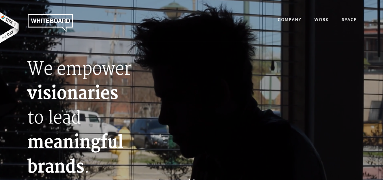
The background is an image. The image changes throughout the viewing of the homepage. There is a statement that expresses the mission of the company that takes up about 1/4 to 1/3 of the screen. There is also a top border, but it is not used for headline purposes; rather the top area a headline would traditionally be has the name of the company in relatively smaller text, with some other navigation links on the upper right hand side. The emphasis is on the changing images of either employees or clients of the company, and the keys words in the mission statement.
Nike

On Nike’s website, there is a break from the grid in their use of a navigation bar at the top of the screen and a navigation box on the left had side. The box takes up less than 1/4 of the screen. The largest image is the sneaker in the background. Furthermore, the headline “Made light to go long” bleeds over the image, and both the text and image draw the viewer attention. However, this creates a great amount of negative space in the center of the screen. This allows us to focus primarily on the product and not other elements of the website.
Glamour

This website is really unique in that it looks like there is a two grid pattern, but the large images and little text break from the more traditional use of grid structures. This website has several large images to the left and right of the screen. However, the images on the right hand side are split between the top and bottom of the screen.
Apple iPhone

Here is another interesting and ubiquitous example of breaking from the traditional grid design. Rather than focusing on the different grids, Apple has focused the viewer’s attention to the center of the screen with “iPhone 6” and the image of the new larger iPhone as the center of attention. With the focus on the center of the screen and not much else around, the designers have created and used a great amount of white space. This helps both the title and product stand out, and not be distracted by other things in the background.
